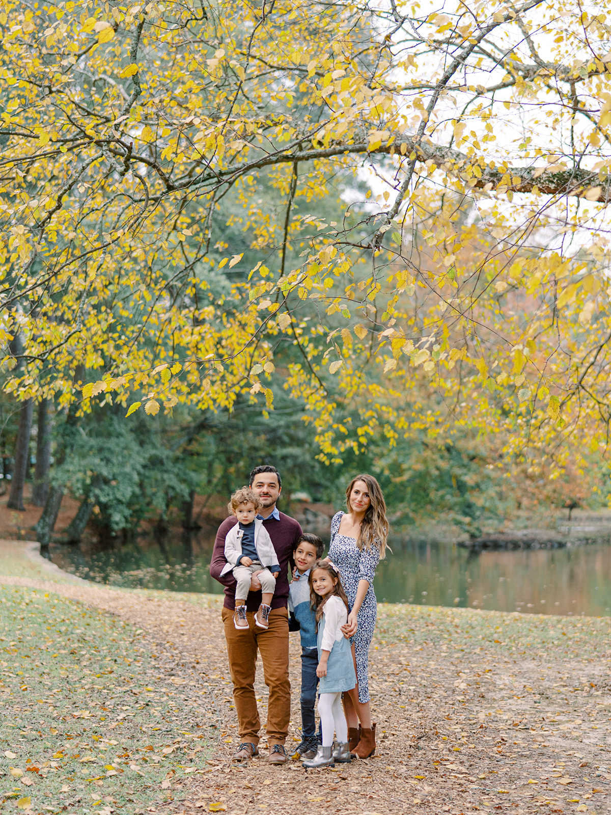
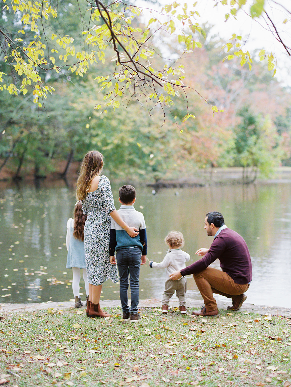
Each Autumn, I have the joy of meeting and re-connecting with some of the most beautiful families and their little ones. With most of our sessions being outside the city of Atlanta, there’s always an array of backdrops to choose from which begs the question of what type of outfits to bring and coordinate for the family session.
While I always suggest that your family sessions should be a reflection of you, your family, and what is “true-to-life”, I’ve found a few common themes and ideas are helpful to follow when trying to plan and harmonize the overall aesthetic of the photos, ensuring that they leave a lasting impression.
1. The 60-30-10 Rule of Color
Considering the tones of each piece is what will make the greatest impact on the photos that you receive. Stay away from the early 2000s theme where everyone is in a monochromatic color palette, or even worse, jeans and a white shirt.
A good rule of thumb is to adhere to the timeless 60-30-10 decorating design rule, which helps create a cohesive color palette. In short, it states that there should be three primary colors that will work together to create a scheme; 60% of a primary color, 30% as secondary, and 10% as your accent color. Don’t forget that having multiple varying tones of color is also a great way to add dimension to your photos.

2. Textures + patterns
Another aspect that is helpful to consider is mixing up differing textures, patterns, and materials. In addition to a beautiful cotton piece, textures like linen, silk, and corduroy photograph beautifully as well.
When considering patterns, consider whether or not you’re using a “busy” pattern (like a ditzy floral) or one that’s more spread out (like a 3-toned stripe shirt). When done well, these can be absolutely stunning and create interest when the viewer looks at each subject.
3. Layering
For the autumn time, another way to effortlessly create a stunning palette is to incorporate secondary colors through accent pieces that layer the primary items. Whether that’s a cardigan, coat, or multiple necklaces, playing with these will oftentimes help with the overall aesthetic.
4. Consider the backdrop
Finally, when designing the items to wear, it’s important to keep in mind what colors the backdrop will have. The last thing you want is to have an ensemble that “competes” with the surroundings. If you have a neutral backdrop, you’re less limited to what would work well with the backdrop. When you have a backdrop that consists of a lot of green, for example, one thing that can be helpful is to look at the universal color wheel and pick a color that’s adjacent, or “complimentary” which, in this example, would be blue and yellow hues.

We offer wardrobe styling services to all of our clients and love the process of finding pieces that suit the scenery and our clients. We’ve also just launched our autumn 2022 mini sessions which are taking place on September 24, September 25, October, 23, and November 5. For more information and for the sign-up page, click here!
add a comment
+ COMMENTS